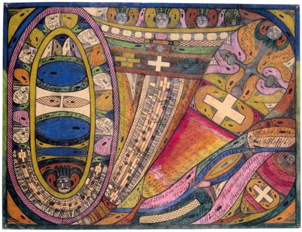
Value study
Strip the picture down to a few flat tones of light and dark, its underlying design. Two ways to look at it: a notan reduction (everything forced into 2, 3, or 5 values) and a layered build-up (the same design painted on tone by tone, darkest last).
Notan reductions
A notan flattens the whole image into a fixed number of value steps so you can read the big shapes at a glance. Pick how many values, then how the cut points are chosen: Equalized spreads the pixels evenly across the tiers so every value reads (best for a clear design); Faithful cuts at even grey levels so the result keeps the picture's true key, light or dark; Otsu finds the single light/dark split that best separates the image's two natural value groups (two values only).
Hover the value counts to preview; click a method to apply it.
Layered build-up
This is the same value design built the way you would paint or draw it: lay in the broadest shade first, then deepen the darks coat by coat, the brightest accents staying untouched until last. Each pass adds one darker coat to the tiers below it, so by the final pass you have the complete five-value structure. This matches the build-up shown on the master paintings. Hover a pass number to preview that stage; the frames are already computed, so it is instant.
Hover 2 · 3 · 4 to reveal the build-up.
Color block-in
The painting reduced to a handful of flat color masses, laid in by coverage, the largest mass first. Switch to the stencil view to get one paintable mask per color. Hover (or tap on a phone) a swatch to preview that step; the frames are already computed, so it is instant.
Hover (or tap on a phone) a swatch to build the block-in up to that color. Show all returns to the complete block-in.
Palette
The painting's colours, each band sized by how much of the canvas it covers, so you can read the palette at a glance: the dominant masses, the supporting tones, and the small vivid accents. Largest coverage first.
Want to build a usable mixing palette from these colours? Open in the Palette Inspiration generator →
Squint test
Step back and the detail falls away, leaving only the value composition, the true test of whether a design reads. Pick a viewing distance.
Take it to the easel
Download PDF Instruction
A printable instruction booklet for painting this work, the value studies, squint ladder, colour block-in and paintable stencils. Pick what you need on the left; the preview is on the right.
Paper size is just the page it prints on (A4 worldwide, US Letter in North America). It does not change your studies or how big you paint, larger paper (A3) just prints each plate bigger. To paint at your real canvas size, turn on Tiling below.
How the grid works. The same grid is drawn over your image and over every stencil, with letters (A, B, C…) across the top and numbers (1, 2, 3…) down the side. Draw a matching grid lightly on your canvas, then copy what you see one square at a time, cell A1 to cell A1, B1 to B1, and so on. Working square by square keeps proportions accurate without tracing. More columns means smaller squares and a more precise transfer; fewer columns is faster and looser.
▭ one printed page ▦ overlap (glue/trim band) ▣ your image on the canvas
How tiling works. To work at your real canvas size, each study is split across several pages, shown above as a grid labelled R1·C1 (row 1, column 1) starting at the top-left. Print every tile page at 100% (turn off "fit to page"), then lay them out by their R·C number. Neighbouring pages share a shaded overlap band: trim along the dashed line and align the ✚ marks, then tape or glue. The result is the study at exact 1 : 1 scale, ready to trace or transfer onto your canvas. Fit keeps the whole image inside the canvas, Crop fills the canvas and trims the overflow, and Stretch distorts the image to the canvas shape.